Ioana Stoica – Design – is there a proper balance between commercial strategy and user-centric design?
At the beginning of this year, the European Data Protection Board (“EDPB”), went beyond giving general guidelines and started analyzing the design of user interfaces (“UI”) and the user experience (“UX”). Even if the guidelines refer to social media platforms, the principles established apply to any business-to-consumer platform.
Is design relevant from a legal point of view?
The interface is the space where all interactions between users and computers occur. In this sense, the UI is the first communication layer between the business and the final user.
If the user enjoys the feel of the app, it might continue browsing. The choices the user makes on the platform, the steps it takes, and the path it follows, are strongly influenced by the options that the designer chooses to implement and the overall feeling of the virtual experience.
As a click might manifest the conclusion of a contract and a swipe might represent the consent to certain data processing activities, UI & UX are not limited to general aesthetics and user responsiveness but help the user convey its will through actions that have profound legal effects.
Solve the fundamental problem, not the symptoms – Don Norman
Don Norman is one of the fathers of human-centered design, advocating for always having in mind all types of users, analyzing a system by analyzing each component, simplifying tasks and making things visible, and thinking about designing for error.
The principles established by EDPB’s guidelines are similar to the principles of design:
- autonomy vs. constraints – the design should grant the users the highest degree of autonomy;
- expectation vs. affordance – the user expectations instilled by the design should correspond to what actually happens;
- consumer choice vs. visibility – the users should be allowed to have and manifest their choice;
- no deception vs. constraints – the information and options given to users should be provided in an objective and neutral way, avoiding any deceptive or manipulative language or design.
Your design, marketing, and product choices will determine the data users share, the use made of the user’s personal data, and their autonomy in choosing the scope and conditions of processing. Also, the language and information you provide will influence their emotional state, allowing them to feel secure, or not, about the choices they make, the contracts they get into, and the data they share.
Examples within the basics of the user journey

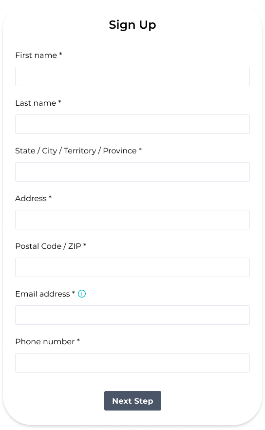
Do you need all that data? Why?
Is it mandatory for the user to provide all the data?
Could you provide the account with fewer data and choose to allow the user to provide additional info, later on?
If you have an input for which you give additional information – is it the best way to show that?

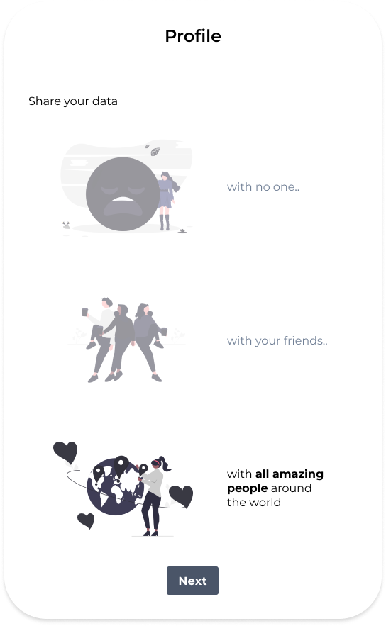
Could the user consider that pre-activating a certain option is constraining or deceptive?
Is the language used clear?
Does it give the user the feeling of autonomy?
Would the user make a different choice if the default option would be a different one?

Is the information provided in a neutral way?
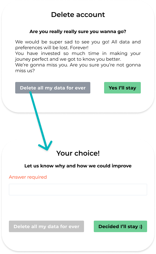
Is the right to deletion of data presented in a manipulative way?
Are we granting the user the highest degree of autonomy?
Design and language that go against the basic principles of human-centric design are likely to constitute a dark pattern. The examples above are supposed to draw the attention of designers, marketers, and product managers. If you discover any of the following patterns, take a step back and, in the words of Don Norman, “You should always think about the big picture – what is the final result that you care about?”
What we are being told, both by legislation and by renowned designers is that the answer should be: users.


No Comments